Figma
Mobile UI/UX
Interactive Prototype
Design System
Component Library
User Flow
Accessibility
Nonla Prototype
Mobile App Concept – Figma Interactive Mockup
August 2, 2025
Overview
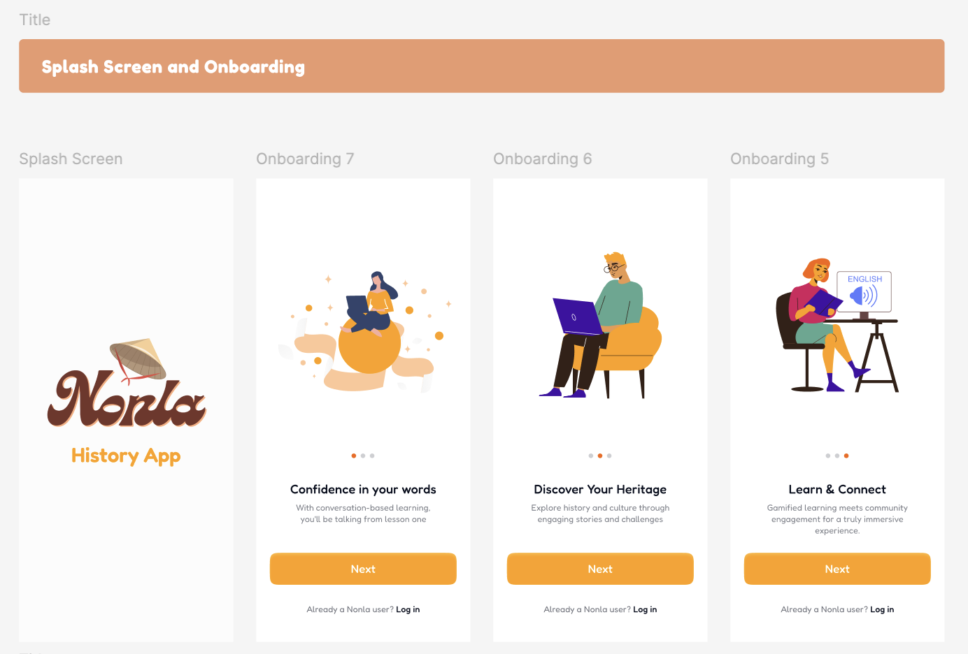
The Nonla Prototype is a mobile-first concept built in Figma, demonstrating a card-driven dashboard for personal productivity and goal tracking. It showcases onboarding flows, user settings, and a dynamic feed of tasks & achievements.
“High-fidelity interactions make it feel like a real app—perfect for early stakeholder testing.”
Here is live preview Link
Screens & Flow
-
Onboarding Carousel
- Four screens with incremental disclosure of core features.
- Progress indicator dots and “Skip” button in top-right.
-
Home Feed
- Infinite vertical scroll of task cards with swipe gestures (“complete” / “snooze”).
- Pull-to-refresh interaction, loaded via Figma’s Smart Animate.
-
Task Detail
- Slide-in panel with checkboxes, due-date picker, and subtasks.
- Modular design tokens:
- Primary color:
#4F46E5 - Secondary:
#6366F1 - Radius:
12px
- Primary color:
-
Settings & Profile
- Toggle for dark mode, push notifications, and data export.
- Accessible typography scale: 16 px base, 24 px h2, 32 px h1.
Design System
- Typography: Montserrat (700/500/400)
- Grid: 4-column, 24px gutter
- Components: Buttons, toggles, modals, bottom nav bar—all in Figma Component Library.
- Interactions: Smart Animate, Delay & Ease-In for natural feel.
Includes built-in a11y checks for color contrast and tap target size.